|
|
Post by paperdragon on Mar 17, 2011 13:37:27 GMT -5
The work in progress 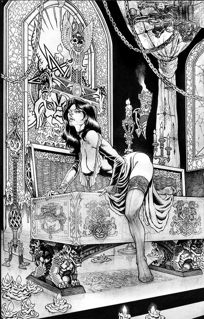  |
|
|
|
Post by bastard on Mar 17, 2011 17:20:25 GMT -5
awesomeness at it's finest!
|
|
|
|
Post by darkartlover on Mar 18, 2011 8:36:18 GMT -5
so much amazing little detail in every little part of this one and from my favorite Vigil work.... but have to ask about her face. it kinda looks like your going for the Buffy creature thing ?
|
|
|
|
Post by darkartlover on Mar 31, 2011 16:36:49 GMT -5
now that's the Tanya i know and love.
|
|
Tim
Slasher
 Rebel Godfather
The Godfather of Horror
Rebel Godfather
The Godfather of Horror
Posts: 323
|
Post by Tim on Apr 5, 2011 0:19:10 GMT -5
only mike has anything to say? really this is a hottie picture. let me know if you like it or not...stop the sleeping mother fuckers
|
|
|
|
Post by darkartlover on Apr 5, 2011 14:25:38 GMT -5
i was wondering why everyone was so quit on this one myself...it rocks. wanted to ask, on the chandelier it's dragons or gargoyles at the top but what's at the bottom ?..babies, angels, little devils ?
|
|
|
|
Post by bastard on Apr 5, 2011 18:49:12 GMT -5
excuse me, note the FIRST comment.
|
|
Tim
Slasher
Rebel Godfather
The Godfather of Horror
Posts: 323
|
Post by Tim on Apr 6, 2011 10:35:35 GMT -5
sorry i keep forgetting its only 3 people here.. glad you all like it...
|
|
|
|
Post by jainitai on Apr 6, 2011 18:43:02 GMT -5
I'm not sleeping. Just always busy with work, baby and family. Usually when I check the boards nowadays I'm doing it from my iPhone, which makes viewing images and posting comments a pain in the ass. I was going to comment on this awhile back, but just kept forgetting. What can be said? It's the usual Tim Vigil ultra-detailed, erotic awesomeness. I don't think this piece in particular is breaking any new ground though. Seems you've mastered perspective and you've always been on your game in the detail department. I wonder: have you perhaps hit an artistic plateau? Kind of like when people go on diets and they hit a point where they stop making progress and losing weight. This image looks like a lot of your other current stuff and the compositions and sets are usually very similar in execution and design. Not saying that's a bad thing, just an unbiased observation. The image of the Death Dealer sitting on a throne comes to mind. Compare it with this one of Tanya and you'll see where your aesthetic currently is. And again, I'm not saying this as a negative. Just pondering your work from an art critic kind of view. Have you maybe progressed to a certain comfort zone where you're using the same conventions and devices in your work? Obviously you're going to draw and paint subjects that interest you, so the content of your work may not change. But perhaps delving into other themes and topics outside of the comic book/pop culture genre will push you to another level of artistic expression. As you know, it's easy for artists to stagnate and become to narrowly focused and influenced in their work. We tend to work with what's comfortable and known to us. We tend to isolate ourselves and work within the parameters and confines of pre-existing assumptions. In other words, we just do what we feel like! Sometimes though it's good to challenge ourselves creatively and artistically by experimenting with other styles, genres, media, etc. and to read about other artists that we may have no interest in. Anyway, I guess I was just saying there's not much to say about this Tanya piece that hasn't been said before. Is it awesome? He'll yeah! But is it anything new? Not so much. And that's what leaves me feeling like, "yeah, I've seen this before." I hope my words have not offended. Not my intention. As artists we like to have our work validated and praised by others. Sometimes we also like honest critiques like these. I'm just trying to give you a little something here, because as you noted, there's only about 3 of us motherfuckers left around here.  Btw, one question related to this piece: how did you get the ornamentation on the coffin so exact and similar on the left and right of her leg? They look almost exact. Did you draw one and then trace it onto the other side? |
|
Tim
Slasher
Rebel Godfather
The Godfather of Horror
Posts: 323
|
Post by Tim on Apr 6, 2011 21:50:53 GMT -5
i hear yah. yeah a good observation..but damn i like what i do. i guess i'll
just have to settle for just being me. one word two syllables...awesome!
just kidding ..oooh my head is tilting, falling to floor, so heavy,,,,
|
|
|
|
Post by jainitai on Apr 7, 2011 18:36:34 GMT -5
Don't get me wrong. I'm not saying there's anything wrong with liking what you do. In fact, even from my studies in art education, I've learned that more genuine, meaningful artwork happens when the artist has interest and emotional investment in what they're creating. That's why a lot of kids get bored with art teachers telling them exactly what to make and how to do it.
So I'm not saying you should be anything other than yourself. That's what makes you unique as an artist and gives you your own style. Anyone could see your work and know immediately, "Yeah, Tim Vigil did that!". Having a consistent, personal style is a sign of artistic maturity.
I guess I was more talking about pushing one's self as an artist. I think that would be cool to see your work taken out of the context of comic books and fantasy and expressing more contemporary issues. And also seeing your exploration and experimentation with other media, like sculpture, collage, printmaking, etc. I think it'd be some far out stuff. And what if your work was more in the context of a gallery experience, like having a clear intention or message in a body of work, like focusing on your feelings about religion or censorship or pornography or politics, etc. and putting together a cohesive show.
Anywho, I'll always love and be inspired by your work even if just keep drawing naked, bloody vampires, werewolves and superheroes. :^)
|
|
Tim
Slasher
Rebel Godfather
The Godfather of Horror
Posts: 323
|
Post by Tim on Apr 8, 2011 4:00:53 GMT -5
focusing on your feelings about religion or censorship or pornography or politics, etc.
i that in my work anyway its just concealed in my influence of comics and fantasy,
like rockwell , i show my attitude of what could be but in a primal sense, a struggle
of the individual confronted by physical and psychological manifestations of the world around
me. a representational view through the metaphore of comic art,
an expressed art form of dyna-pop
i'm an old leather shoe that feels comfortable and not interested in trying new involved
mediums. am still searching for the perfection in my own style.
keep letting me know your views, i respect your critiques. you'll have to write my forward to my art book.
don't hate me for spelling mistakes..ughhhh
|
|
|
|
Post by smile4chaos on Apr 8, 2011 16:22:56 GMT -5
Jay had a lot of valid points, and said everything in a lot clearer way than I could have at the moment.
It is a beautiful piece, and I keep looking at the inking. Did you use a lot of tech pens on this one like you did that last sinbuck piece that was posted?
|
|
Tim
Slasher
Rebel Godfather
The Godfather of Horror
Posts: 323
|
Post by Tim on Apr 8, 2011 16:57:15 GMT -5
i have been using the tech pin alot lately with all the details. i've been getting some nice fluid and cross hatched lines with it. most pics as of late are 90% pen.
my brushs are failing me with their tips. hard to find a great brush these days
|
|
|
|
Post by smile4chaos on Apr 9, 2011 5:06:29 GMT -5
Ok, thought so. I like the way the pens look. It gives the pieces a tiny bit of a different feel to me. And it does make the details stand out so much more.
The linework looks amazing, the sinbuck pic in particular was amazing in detail, not that this, or any others aren't. But was really the first time I noticed a big difference.
I really like the rapidigraph rotrings, I have had a good amount of success, or just been happy with the way I can control the ink flow.
Even if the pieces aren't necessarily breaking new ground, it is great to look at what you can create, and I can tell that you enjoy what you are creating.
|
|